We have worked with Parties That Cook since 2005 on a number of their design elements from stationery design, recipe decks, website, email newsletter, video and outdoor signage. When Parties That Cook approached us about a new identity logo design we jumped at the opportunity.
For the new logo design we worked on numerous type studies. There were also many discussions about the whisk, should it stay or go? In the end we kept the whisk as a part of the design and even mounted it to the front of 271 Francisco, long live the whisk!
The new Parties That Cook logo identity is easy to read, recognizable and fun. After the initial brand redesign we got back in the "kitchen" with their marketing and began the process of the redesigning and developing their new website.
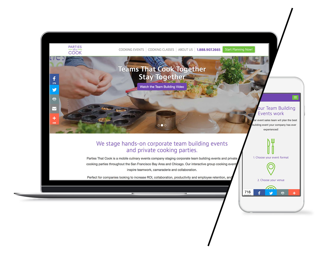
The goal of the new responsive website design is to simplify the user experience and improve leads and conversions. Quickly explain what they do, how their services work and visually deliver their brand personality in a clean, engaging and fun way.
Logo identity design

Brand automobile design

Website design

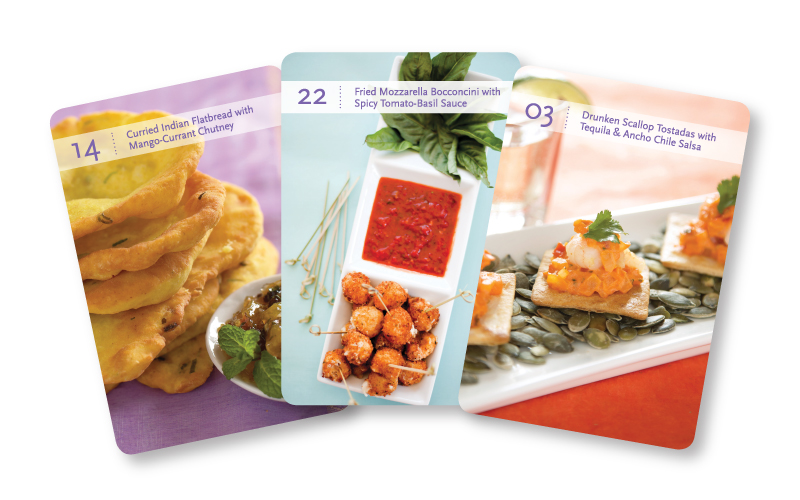
Recipe deck card design

From the client
“Hi guys, I've been thinking about the new website all day and I just want to say congratulations on doing a great job. I know it was a really long process to get it done and so many other things of been going on but you just did a great job. So thank you and let me know when you press the button so I can share it with friends.”
Bibby Gignilliat, Owner